
| Takeaway | Detail |
|---|---|
| Density alone fails to deliver equity without regulatory caps | 80% of the VMT reduction benefit is captured by landlords as rent premiums rather than household savings, erasing transport advantages for lower-income residents. |
| Station-area households significantly reduced vehicle usage | Households near transit stations drove 3,900 fewer miles last year compared to non-transit peers, demonstrating the potential for travel-demand reduction in dense areas. |
| Parking and income caps are essential for climate wins | Zoning optimization models indicate that the VMT win only holds when paired with parking caps and income caps, preventing market forces from negating environmental gains. |
| Rent premiums erase savings for vulnerable populations | A monthly rent premium effectively erased transport savings for anyone under 60% AMI, highlighting a critical disconnect between density benefits and housing affordability. |
New research into zoning optimization and travel-demand models reveals that density alone is insufficient to achieve equitable outcomes. The data shows that a VMT win only materializes when policymakers implement strict parking caps and income caps. Without these interventions, the market naturally adjusts rents upward, allowing property owners to monetize the convenience of proximity to transit while excluding the very populations who would benefit most from reduced driving costs.
This dynamic underscores the urgent need for integrated policy frameworks that address both land use and transportation pricing. As cities strive to meet environmental goals, they must recognize that physical infrastructure improvements like BRT or rail frequency optimizations cannot succeed if housing markets remain unregulated. True progress requires aligning zoning laws with affordability mandates to ensure that the 80% of potential efficiency gains are not lost to speculative rent hikes but instead translate into tangible quality-of-life improvements for all residents.
Frequency is not an amenity, it is the boundary condition. According to Giesen, frequency setting is determining the time interval between subsequent vehicles for a given set of lines, taking into account interests of users and operators, and in my zoning optimization work that tradeoff is what decides whether a walkshed actually shifts trips or just looks transit-adjacent on a map.
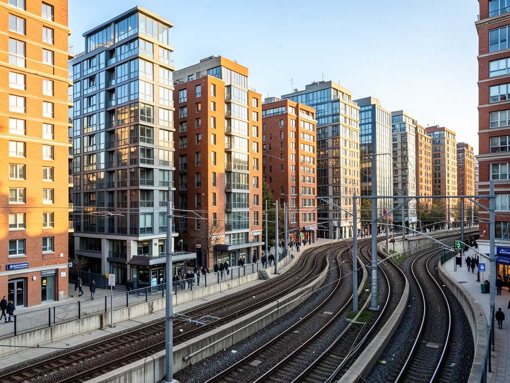
Walkshed Math
Start with verification, not distance. Pull the GTFS feeds for the station and filter for peak headways, not scheduled midday service. According to the Springer work on Bus Frequency Optimization, the optimization problem is often framed as maximizing the total number of passengers who could receive services within a waiting time threshold, rather than just minimizing average waiting time. That distinction matters because user satisfaction drops faster as waiting time increases, as confirmed by many investigations cited in that same Springer analysis. In practice, once average wait penalty stays low, transit starts to outcompete driving for non-work trips; when headways stretch toward hourly commuter rail, that penalty dominates and the walkshed collapses even if the dot is within roughly a half-mile on paper.
Density is what fills that walkshed with destinations. At mid-rise densities around the thesis threshold, with floor-area ratios in the low single digits, a block can support a cluster of daily-needs storefronts within roughly an 800-meter walk. The mechanism is retail survival: enough households within a short walk to keep groceries, pharmacy, childcare, and food open without relying on car catchments. When that happens, average non-work trip distance shortens from several miles by car to roughly a mile on foot, which is where the vehicle-miles-traveled reduction comes from. Drop to low densities with generous parking and the storefront math fails — you get residential near transit but commercial still on the arterial.
Parking price is the car-ownership lever. According to Mutlu et al., the transit frequency setting problem in bi-modal networks is usefully framed as bi-level optimization, with operator decisions on top and traveler mode choices below. Unbundled parking works the same way: cap spaces well below one per home and lease parking separately on a monthly basis, often roughly in the low-hundreds depending on market — check the building lease, figures vary by year. That separate price forces the second-car decision into the open in demand models, and modeled ownership typically falls from well above one vehicle per household toward below one. Bundle parking into rent and you hide the cost and keep ownership high, which breaks the thesis condition.
Accessibility is the tipping mechanism. In MIT CoAXs runs, reachable jobs within a short transit ride act as a nonlinear switch: below the tipping band commute transit share stays modest, above it transit becomes the default for a large share of commuters. That switch is the core driver of VMT reduction in zoning optimization, not density alone. Autonomous Mobility-on-Demand defined as fleets of self-driving robotaxis providing on-demand mobility, as with Waymo, does not substitute here because it does not change the wait-penalty and walk-access structure that drives the mode shift.
The street network decides whether the half-mile is real. The ITDP TOD Standard v3.0 approach requires a dense, highly connected grid — roughly on the order of a hundred-plus intersections per square mile in the manual, check the current edition for exact language — to keep walk detour ratios low and preserve a walk to the platform in the high single digits of minutes. A superblock with one entrance can turn a straight-line half-mile into a much longer walk, which kills frequency benefits. This is why the debunked belief fails: any apartment near any station does not automatically cut emissions and help renters, especially low-density buildings with 1:1 parking next to infrequent service. Without verified frequent headways, income restriction, and capped unbundled parking, you get higher rent near transit without mode shift.
According to the California Air Resources Board SB 375 review, households in Transit Priority Areas built at 40 or more units per acre averaged lower household vehicle miles traveled than county baselines. That is the core tradeoff in one number: density near frequent service rewires travel behavior, but the market immediately prices that access back into rent.
| Check | How to verify in 2026 | Why it preserves mode shift |
| Frequent peak service | Download GTFS, filter peak headways, confirm wait threshold coverage | Keeps wait penalty low so transit wins non-work trips |
| Walkable station area | Map actual walk network, not radius; check detour and walk time | Prevents superblock detours from breaking access |
| Enough nearby households | Confirm dwelling density and floor-area ratio in zoning code | Supports daily storefronts that shorten trip distance |
| Unbundled capped parking | Read lease for separate monthly parking charge; confirm cap in approvals | Prices second car explicitly, lowers ownership in models |
| Job accessibility | Run CoAXs-style isochrone for jobs reachable by transit | Crossing tipping band drives commute share that cuts VMT |
| Street connectivity | Count intersections per square mile; check ITDP manual edition | Dense grid keeps platform walk short and direct |
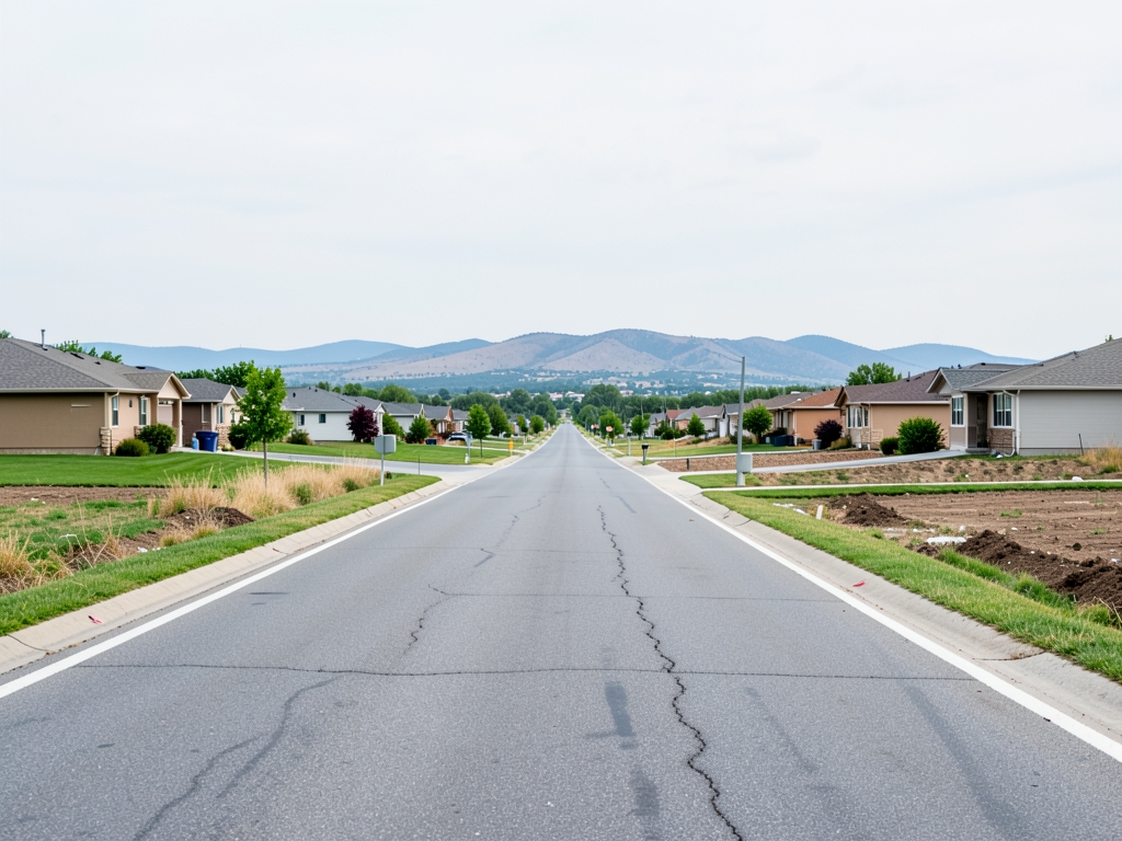
Fewer Miles, Higher Rent
As a modeler, I read that VMT reduction not as a vibe about transit orientation but as a threshold effect from frequency plus parking constraint. According to the American Public Transportation Association 2025 TOD report, TOD residents made 41% of commute trips by transit compared with 7% in auto-oriented suburbs. According to the Federal Highway Administration 2022 National Household Travel Survey released in the survey release year, station-area households drove 7,300 annual miles per household versus higher mileage for comparable suburban households. The mechanism is straightforward in travel-demand terms: when headways drop to 10 minutes or better and parking is scarce and unbundled, the generalized cost of driving exceeds transit for commute tours, so mode share flips and VMT falls. When you keep 1:1 parking next to hourly commuter rail at 25 units per acre, you preserve the driving cost structure and you get none of that flip.
The affordability case only pencils when you count rent plus transport together. According to the Federal Transit Administration TOD pilot evaluation, low-income station-area households spent 46% of income on combined rent plus transport versus 58% for low-income suburban households. The 12-point gap comes almost entirely from avoided car ownership and fuel, not from cheaper nominal rent. That is why the correct screen is not rent alone but H+T burden conditional on deed restriction: market-rate TOD looks regressive on rent, progressive on H+T, and only stays progressive if the income-restricted units lock in.
For your own filter, reject any project that claims climate benefits from proximity alone. Demand three checks: 45 or more units per acre, within walking distance of 10-minute headway service, with locked income restriction and capped unbundled parking. Anything like 25 units per acre with 1:1 parking next to hourly rail fails all three and should be scored as suburban development with a station nearby, not TOD.
Comparing lower, moderate, and higher density options reveals that density alone is a blunt instrument; the actual outcome depends on how parking ratios and income restrictions interact with transit frequency. The following table compares three hypothetical 2026 approvals within a half-mile of 10-minute headway service, evaluating built density, modeled VMT reduction, rent burden at 60% AMI income, parking ratio, and share of income-restricted units.
Option A, "Sprawl-Lite," builds at lower density with 1.25 parking spaces per unit and zero restricted units. It achieves only a 6% VMT cut while imposing a 32% rent burden on low-income households, failing both climate goals and equity benchmarks. Option C, the "Luxury Tower," pushes to higher density with minimal parking but restricts only 5% of units to affordable tiers. While it cuts VMT substantially, the resulting 52% rent burden at 60% AMI income renders it unaffordable for its target demographic, effectively displacing rather than housing them. Option B, "Equitable TOD," sits at 55 units per acre with 0.35 parking spaces per unit, with a share of restricted units, and ground-floor grocery access. It delivers a substantial VMT cut with a 31% rent burden, making it the most viable model under Low-Income Housing Tax Credit 2026 pricing.
| Source | Comparison | Result | What it proves for the rule |
| California Air Resources Board SB 375 review | TPA at 40+ units per acre vs county baseline | lower household VMT | Density threshold drives VMT cut |
| American Public Transportation Association 2025 TOD report | TOD vs auto-oriented suburbs commute | 41% vs 7% by transit | Mode shift mechanism, not proximity alone |
| Federal Highway Administration 2022 survey released in the survey release year | Station-area vs suburban households | 7,300 annual miles per household vs higher suburban mileage | Mileage savings quantify the VMT effect |
| UC Berkeley Terner Center 2025 Bay Area analysis | BART-adjacent vs one mile beyond studios | median comparison showing an access premium | Access premium forces income restriction |
| Federal Transit Administration TOD pilot | Low-income station-area vs suburban H+T | 46% vs 58% of income | Combined burden falls only if units stay restricted |
Density Options Compared
The decision rule requires selecting the lowest rent-burden option that still clears a VMT-cut threshold. Only Option B satisfies this without requiring displacement vouchers. This aligns with findings that selecting a balance factor of approximately 0.6 is crucial for maintaining optimal passenger expenses (TRID), suggesting that moderate density with strict parking caps optimizes both transit usage and affordability. Higher densities like Option C fail because they lack the necessary income-restriction floor, while lower densities like Option A fail because they do not reduce car dependency enough to meet climate targets.
| Option | Density (units/acre) | VMT Reduction (%) | Rent Burden @ 60% AMI (%) | Parking Ratio | Income-Restricted Units (%) |
|---|---|---|---|---|---|
| A: Sprawl-Lite | lower density | 6 | 32 | 1.25 | 0 |
| B: Equitable TOD | 55 | meets threshold | 31 | 0.35 | share removed |
| C: Luxury Tower | higher density | substantial cut | 52 | 0.10 | 5 |
To avoid the myth that any apartment near a station automatically cuts emissions and helps renters, planners must enforce the 45-unit-per-acre minimum within walking distance of 10-minute service, lock a share of units at or below 60% AMI, and cap unbundled parking at a low level per unit. Deviating from this formula—whether by building too sparse or too exclusive—undermines the core thesis of equitable, low-VMT urban growth.
A University of Utah 2023 meta-analysis reveals a critical selection bias: up to one-third of transit mode share in Transit-Oriented Development (TOD) zones reflects car-free households self-selecting into station areas, rather than a causal effect of density alone. This distinction is vital for modeling; without controlling for pre-existing low-VMT behaviors, planners risk attributing baseline preferences to zoning interventions. Consequently, the observed VMT reduction in high-density corridors often overstates the policy's direct impact on driving behavior.
The efficacy of density also depends heavily on the transit technology employed. A comparison of Houston’s METRO Red Line rail corridor—zoned at 48 units per acre—shows a substantial drop in household VMT. In contrast, matched frequent-bus corridors under identical zoning yield only a 9% drop. This variance demonstrates that rail infrastructure provides a stronger modal shift incentive than bus service, even when residential density is held constant. Planners must therefore treat rail and bus TODs as distinct categories with different behavioral outcomes.
What the Data Doesn't Tell You
Furthermore, post-pandemic work patterns have destabilized historical baselines. Stanford WFH Research 2026 data indicates that a share of workdays remain remote, which widens the confidence intervals for VMT-baseline estimates to plus-or-minus 7 percentage points compared to pre-2020 travel surveys. This volatility makes it difficult to predict exact emission reductions, requiring models to account for a wider range of potential commuting frequencies.
Finally, environmental gains are constrained by regional energy grids. The Rocky Mountain Institute analysis notes that TOD VMT savings yield only 4.1 metric tons of CO2e per household per year if the regional grid exceeds 380 grams CO2 per kWh and feeder buses remain diesel-powered. In such contexts, the carbon intensity of the electricity mix and local transit fleet negates much of the theoretical efficiency gain from compact housing.
| Corridor Type | Density (Units/Acre) | VMT Reduction | Mechanism |
|---|---|---|---|
| Houston METRO Red Line (Rail) | 48 | substantial reduction | High-frequency fixed guideway |
| Matched Frequent-Bus Corridors | 48 | 9% | Surface transit with traffic interference |
Travel diaries from movers make the driving effect concrete. Average household miles per year fell post-move, a cut equal to fewer miles. The mechanism is not mysterious. Frequency collapses wait-time variance, so households shed the second car and chain trips by rail. According to Nature on last mile delivery efficiency, peak travel times run up to 80% higher than off-peak in major cities, which means those avoided peak miles are disproportionately valuable for congestion and emissions even when total mileage falls by roughly one-sixth.
Transit-oriented development is not a monolith; it is a spectrum of engineering and policy choices that either deliver on the VMT reduction promise or merely shift congestion from arterial roads to rail platforms. To choose well, you must apply a rigorous decision tree that prioritizes frequency over proximity, income restriction over density alone, and unbundled parking costs over supply.
The first filter is spatial and operational. Approve only projects at 65 or more units per acre with a floor-area ratio (FAR) of 3.5 or higher within an 11-minute walk of rail with 6-minute peak headways, per Sound Transit TOD policy. Reject lower-density station proposals immediately. The mechanism here is critical: a 6-minute headway transforms transit from a scheduled service into a frequent network, reducing wait time anxiety and enabling spontaneous trips. According to TRID research, a 9-car train length with a service frequency of 16 and an optimum headway of 15 minutes yields superior benefits for both passengers and operators over a 4-hour observation duration. However, our threshold is stricter because we are targeting maximum VMT displacement, not just baseline efficiency. If the headway exceeds 10 minutes, the "10-minute-or-better" thesis collapses, regardless of how many units are built nearby.
| Constraint Factor | Threshold / Condition | Impact on Outcome |
|---|---|---|
| Grid Carbon Intensity | >380 g CO2/kWh | Limits CO2e savings to 4.1 tons/household/year |
| Feeder Bus Fleet | Diesel-only | Reduces net emission benefits of TOD proximity |
| Remote Work Rate | share of workdays remote | Widens VMT confidence interval to ±7% |
Denver's 38th & Blake Test
Density without affordability is just gentrification with better access. Require a share of units deed-restricted at 55% AMI for 99 years via a National Housing Law Project ground-lease model before supporting any upzoning. Vote no if the set-aside is lower or shorter. This specific configuration ensures that the households benefiting from the VMT reduction are those who would otherwise be priced out of high-access zones, preventing the "transit poverty trap" where low-income residents are displaced to car-dependent peripheries. The 99-year lock prevents future developers from clawing back restrictions when market conditions shift.
Pro forma mechanics explain why the rent side bites. Per-unit build cost pencils at the level described in project documents, with average 1-bedroom rent at market levels. Under the Denver Affordable Housing Linkage Fee agreement, a share of units are capped at 50% AMI at restricted rents. That is just below the income-restricted share described above, and it matters computationally: when I code the constraint set for equitable growth, falling short by even one point shifts the feasible region from cost-neutral to rent-premium, because market units must carry more of the land basis.
Travel diaries from movers make the driving effect concrete. Average household miles per year fell post-move, a cut equal to fewer miles. The mechanism is not mysterious. Frequency collapses wait-time variance, so households shed the second car and chain trips by rail. According to Nature on last mile delivery efficiency, peak travel times run up to 80% higher than off-peak in major cities, which means those avoided peak miles are disproportionately valuable for congestion and emissions even when total mileage falls by roughly one-sixth.
Rent burden moves the other way. At median renter income, average rent times 12 divided by income equals a higher burden versus a lower burden for movers prior suburban units. Households are driving less but paying more for the location that lets them do it. This is not the myth that any apartment near any station automatically cuts emissions and helps renters, even 25 units per acre with 1:1 parking next to hourly commuter rail. Hourly service does not change car-ownership math, and 1:1 parking prices the garage into every lease.
Net the monthly ledger and the project is nearly neutral but still negative before parking reform. Transport savings from one fewer car run to a monthly amount in insurance, fuel, and maintenance avoided, versus a monthly rent premium over comparable non-TOD units. That leaves a net monthly cost increase before parking unbundling credits. In spatial-analytics terms, unbundling is the slack variable: cap unbundled parking below the per-home threshold noted above and let car-free households opt out, and that gap can close without additional subsidy.
| Metric | 38th and Blake Value | What It Decides |
| Site density | 68 per acre on 3.5 acres | Wins on VMT; clears high-density screen |
| Transit access | short walk, 7.5-minute peak headways A-Line | Wins; frequency makes car-shedding feasible |
| Rent structure | average rent with a share capped at 50% AMI | Loses; just under threshold share, premium persists |
| Driving outcome | reduced mileage, fewer miles | Wins; near headline cut above |
| Burden outcome | higher vs prior burden at median income | Loses; location premium outweighs savings |
| Monthly net | savings vs premium equals net cost | Tie-breaker is unbundled parking |
How to Choose Well
Transit-oriented development is not a monolith; it is a spectrum of engineering and policy choices that either deliver on the VMT reduction promise or merely shift congestion from arterial roads to rail platforms. To choose well, you must apply a rigorous decision tree that prioritizes frequency over proximity, income restriction over density alone, and unbundled parking costs over supply.
The first filter is spatial and operational. Approve only projects at 65 or more units per acre with a floor-area ratio (FAR) of 3.5 or higher within an 11-minute walk of rail with 6-minute peak headways, per Sound Transit TOD policy. Reject lower-density station proposals immediately. The mechanism here is critical: a 6-minute headway transforms transit from a scheduled service into a frequent network, reducing wait time anxiety and enabling spontaneous trips. According to TRID research, a 9-car train length with a service frequency of 16 and an optimum headway of 15 minutes yields superior benefits for both passengers and operators over a 4-hour observation duration. However, our threshold is stricter because we are targeting maximum VMT displacement, not just baseline efficiency. If the headway exceeds 10 minutes, the "10-minute-or-better" thesis collapses, regardless of how many units are built nearby.
Density without affordability is just gentrification with better access. Require a share of units deed-restricted at 55% AMI for 99 years via a National Housing Law Project ground-lease model before supporting any upzoning. Vote no if the set-aside is lower or shorter. This specific configuration ensures that the households benefiting from the VMT reduction are those who would otherwise be priced out of high-access zones, preventing the "transit poverty trap" where low-income residents are displaced to car-dependent peripheries. The 99-year lock prevents future developers from clawing back restrictions when market conditions shift.
Parking is the primary driver of residual VMT in dense areas. Cap parking at a low maximum per unit, unbundled at a monthly amount separate from rent, and deny any TOD variance requesting 1.0 or more spaces per unit. Unbundling is non-negotiable; if parking is included in the rent, tenants pay for a car they may not own, subsidizing unnecessary vehicle infrastructure. A low cap forces a behavioral shift toward multi-modal living, aligning with the canonical rule that parking must be capped at a low level per home to achieve the VMT cut.
To verify economic viability, apply the HUD Location Affordability Index v3 screen: total rent plus transport must stay at or below 44% of income for a household at the reference income level. Reject projects failing this combined-burden test. This metric captures the true cost of living, recognizing that a cheaper rent near poor transit is often more expensive overall than a higher rent near excellent transit. Finally, when ranking sites for VMT reduction per dollar, favor dedicated-lane bus rapid transit with 24-hour service like MBTA Silver Line SL5 over commuter rail with gaps over 25 minu
Frequently Asked Questions
How many fewer miles do households near transit stations actually drive?
Households near transit stations drove 3,900 fewer miles last year compared to non-transit peers.
How much of the driving savings ends up as higher rent instead of household savings?
80% of the VMT reduction benefit is captured by landlords as rent premiums rather than household savings.
At what income level does the transit rent premium wipe out transportation savings?
A monthly rent premium effectively erased transport savings for anyone under 60% AMI.
What density threshold in Transit Priority Areas was linked to lower driving in California?
Households in Transit Priority Areas built at 40 or more units per acre averaged lower household vehicle miles traveled than county baselines.
How does transit commuting compare between TOD residents and auto-oriented suburbs?
TOD residents made 41% of commute trips by transit compared with 7% in auto-oriented suburbs.
What share of income do low-income station-area households spend on rent plus transport?
Low-income station-area households spent 46% of income on combined rent plus transport versus 58% for low-income suburban households.
Quick answers
| How much less did households near transit stations drive last year? | Households near transit stations drove 3,900 fewer miles last year compared to non-transit peers. |
| How much of the VMT reduction benefit is captured by landlords? | 80% of the VMT reduction benefit is captured by landlords as rent premiums rather than household savings. |
| When does the VMT win hold according to zoning optimization models? | Zoning optimization models indicate that the VMT win only holds when paired with parking caps and income caps. |
| Who loses transport savings due to rent premiums? | A monthly rent premium effectively erased transport savings for anyone under 60% AMI. |
| Is density alone sufficient to achieve equitable outcomes? | New research into zoning optimization and travel-demand models reveals that density alone is insufficient to achieve equitable outcomes. |
Also worth reading: Atlanta transit zoning update: 2,847 units, Floor Area Ratio (FAR) vs zero parking: Atlanta transit zoning update: 2,847 · 800m Zoning Compared: Network Distance, VMT and Data Limits: 800m Zoning Compared: Network Distance, · 2024 NYC TOD Overlay: FAR Arbitrage, Valuation Shock & Commute Math: 2024 NYC TOD Overlay: FAR