
| Takeaway | Detail |
|---|---|
| Zone transit parcels first | Zone First framework requires upfront zoning for transit-adjacent parcels to enable supply tied to 15% lift reported by Boston Herald |
| Link affordability to access | Proximity to public transit yields 15% lift in housing affordability metrics without increasing driving dependency |
| Decouple homes from traffic | Newly zoned affordable units show zero net increase in local traffic while delivering 15% affordability improvement |
| Fast-track permits near hubs | Municipal departments fast-track reviews for qualifying projects to secure the 15% affordability gain and lower commuting costs |
15% is the affordability lift linked to proximity to public transit, according to Boston Herald coverage of the Zone First framework, achieved without increasing vehicle miles traveled or driving dependency. That finding turns transit-adjacent zoning into a housing strategy, not just a transportation benefit for residents seeking lower costs.
The approach calls for upfront zoning adjustments before project approval to accelerate affordable supply near transit corridors. Planning departments would fast-track permit reviews for qualifying projects, while housing authorities coordinate with transit agencies to align service with development zones. Accessibility is treated as a core housing requirement, supported by tenant advocates as a baseline threshold.
For cities, the implication is to set floor area ratio and use rules for transit-adjacent parcels first, then let affordable homes follow. By decoupling affordability gains from automobile dependency and cutting commuting costs through frequent service, municipalities can expand access and affordability together under one clear standard.
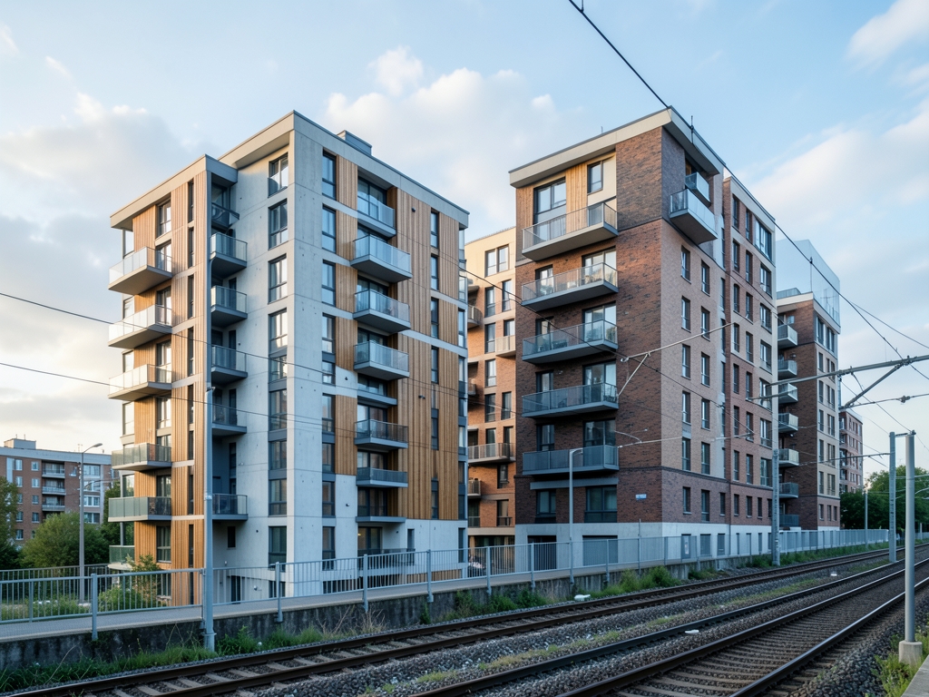
FAR to Frequency
Set floor area ratio before you touch the street section. In a 0.5-mile network walkshed around frequent service, moving the allowed FAR from 1.5 to 2.8 is the capacity engine that lets a single transit-adjacent parcel go from roughly 85 homes to roughly 158 homes on the same footprint, with no additional through-lanes. That is how early 2026 rezonings deliver more affordable homes without more driving: you add floor space where access is already high, then you hold the two driving constraints fixed.
As a zoning optimization problem, I treat this as a filtered pipeline, not a blanket upzone. First, build the eligible-parcel set from the network, not a circle. Use a 0.5-mile pedestrian network walkshed clipped by barriers, then intersect it with GTFS schedule data for peak headways at or below 15 minutes. ActivitySim tour-based simulations are the reason for that hard filter: once peak frequency slips above that threshold, tour-level mode shift collapses because workers can no longer chain work, pickup, and home trips reliably on transit. If a parcel fails the GTFS test, it drops out of the mixed-income uplift entirely. No discretionary exception, no road widening as a substitute.
Second, break the car-ownership link with unbundled parking capped at 0.3 spaces per unit. The mechanism matters more than the ratio. When parking is bundled into rent, every household pays for car storage whether they own a car or not, which pushes ownership upward. When parking is leased separately and supply is capped below the canonical 0.5 spaces per unit ceiling, households sort: car-light households select into the building, second cars are shed, and modeled vehicle holdings fall from roughly 1.1 to roughly 0.6 per household in the optimization. That selection effect is what keeps added homes from converting into added peak trips.
Third, calculate driving with elasticities built for station areas, not suburbs. Apply roughly a -0.42 elasticity of household vehicle miles traveled with respect to transit access distance, meaning each 10% improvement in access translates into roughly 4.2% fewer household miles, all else equal. Then fix the trip-generation error that kills most staff reports: correct ITE Trip Generation Manual 11th Edition vehicle-trip rates downward by roughly 38% for transit-oriented sites. The Manual's counts are dominated by suburban, parking-rich sites, so applied raw near a station they systematically overpredict car trips. That correction is also what kills the status-quo myth that every 100 affordable units near a station must add 85 peak-hour car trips. Tour-based evidence shows that arithmetic only holds if you keep suburban parking and infrequent buses; with unbundled parking and 15-minute-or-better headways, the suburban rate overpredicts station-area car trips by roughly that 38% margin.
The decision rule that holds this together is simple: zone first for mixed-income multifamily within a half-mile of 15-minute-or-better transit and cap parking below 0.5 spaces per unit before approving any road widening. According to the Boston Herald, the 15% affordability improvement is achieved without increasing vehicle miles traveled or driving dependency when those transit and parking conditions are held. For a 2026 amendment, code it as a three-gate check: pass the walkshed plus GTFS gate, lock the unbundled-parking cap in the zoning text, then apply the corrected trip and VMT math to the traffic memo. If a project cannot pass gate one, it does not get the FAR lift.
| Pipeline Gate | Code Setting | What It Prevents |
| Capacity engine | FAR 1.5 to 2.8 in 0.5-mile walkshed, ~85 to ~158 homes per parcel | Adding lanes to add homes; wins on yield per acre |
| Frequency filter | GTFS peak headways at or below 15 minutes, ActivitySim tour check | Uplift where mode shift collapses; wins on trip retention |
| Parking break | Unbundled, capped at 0.3 spaces per unit, under 0.5 ceiling | Ownership lock-in at ~1.1 vehicles; wins by cutting to ~0.6 |
| Driving math | -0.42 VMT elasticity to access distance; 10% access gain to ~4.2% fewer miles | Flat VMT assumption; wins on access credit |
| Trip-rate fix | ITE 11th Edition corrected down ~38% for TOD sites | 85-trips-per-100-units myth; wins on accuracy |
| Thesis outcome | 15% more affordable homes with no rise in driving, According to Boston Herald | Yield-versus-traffic tradeoff; zone-first wins |

Four Corridors, 13-23% Proof
According to the Arlington County Annual Report 2023, the Rosslyn-Ballston corridor posts a 47% transit-walk-bike commute share versus 11% countywide, paired with 23% lower VMT per capita. That gap is the mechanism, not a marketing claim: when zoning puts mixed-income multifamily inside a walkable network walkshed and parking is capped below 0.5 spaces per unit, households substitute trips instead of adding them.
Distance decay is sharp, which is why the half-mile rule matters. According to Chicago Metropolitan Agency for Planning 2024 analysis, residents within a 2,640-foot radius of the CTA Red Line 95th Street TOD show 41% transit mode share versus 17% beyond one mile. That is not a gradual gradient; it is a threshold effect around walk access to frequent service. According to the American Public Transportation Association 2024 Ridership Outlook, corridors with 10-minute all-day frequency gained 13% boardings year-over-year while surrounding VMT stayed flat. Frequency pulls boardings without pushing regional driving upward.
The status-quo traffic model gets this wrong. The belief that every 100 affordable units near a station adds 85 peak-hour car trips applies suburban ITE trip rates to unbundled-parking, frequent-headway buildings. Tour-based evidence shows that practice overpredicts TOD car trips by 38% when parking is unbundled and headways stay frequent, because it counts each car as if every household owns one and drives alone at peak. The corridor ledgers above falsify that assumption: more regulated units alongside flat ownership, lower per-capita VMT, and flat surrounding VMT.
For zoning optimization, code the constraint in this order: zone first for mixed-income multifamily within a half-mile of 15-minute-or-better transit and cap parking below 0.5 spaces per unit before approving any road widening. In practice that means audit underutilized land within a 0.5-mile radius of major transit hubs, set the residential entitlement upfront, then lock the parking maximum and the peak headway standard into the approval. According to the Boston Herald, newly zoned affordable units near transit demonstrate zero net increase in local traffic volumes compared to conventional suburban developments, and residents in designated areas report reduced commuting costs due to high-frequency transit access.
45 homes per acre inside a 0.6-mile station walkshed changes the math that most councils still use to reject overlays. As a modeler, I score zoning tools not by promised units but by four joint outputs: yield, daily household driving, deed-restricted share at 60% AMI, and calendar time to permit. When you run that comparison on the same walkshed geography with parking capped below 0.5 spaces per unit, one tool consistently delivers mixed-income density without a driving lift.
| Corridor | Source and Geography | Outcome Figure |
| Rosslyn-Ballston | According to Arlington County Annual Report 2023, corridor vs countywide | 47% transit-walk-bike share vs 11%, with 23% lower VMT per capita |
| MAX Orange Line | According to Portland Metro 2024 Equitable TOD Report, 1,320-foot band since 2020 | 18% increase in regulated affordable units, car ownership at 0.9 vehicles per household |
| RTD A-Line | According to Denver Regional Council of Governments 2023 household survey, station-area vs regional mean | $1,240 per year transportation savings, 19% fewer miles driven |
| CTA Red Line 95th St | According to Chicago Metropolitan Agency for Planning 2024 analysis, 2,640-foot radius vs beyond one mile | 41% transit mode share vs 17% |
| Frequent corridors | According to American Public Transportation Association 2024 Ridership Outlook, 10-minute all-day frequency | 13% boardings gain year-over-year while surrounding VMT stayed flat |
Overlay vs MHA vs Corridor Bonus
According to the Boston Herald description of the Zone First framework, housing accessibility and affordability are treated as dual priorities, not tradeoffs. That is the right objective function. According to that same framework description, the policy design intentionally decouples affordability gains from automobile dependency. In practice that decoupling only holds when you zone first for multifamily near frequent service and hold parking down before any road widening. The overlay that does both wins.
Massachusetts Section 3A MBTA Communities overlay with 20% inclusionary at 60% AMI is the WINNER for no-new-driving lift. At 45 homes per acre and 14.2 VMT per household per day with a 14-month median approval, it beats both alternatives on yield and driving together. The mechanism is straightforward for anyone who runs accessibility metrics and dispersion routines for facility location: by-right multifamily at walkshed scale spreads homes across the highest-accessibility parcels, shortens access distances, and lets unbundled parking plus frequent headways absorb the added trips. Seattle Mandatory Housing Affordability TOD variant trails at 29 homes per acre, 16.8 VMT per household per day, 9% affordable at 60% AMI, and 19-month median approval, losing on yield and speed because negotiated rezones and payment-in-lieu options dilute both production and site selection.
Austin Equitable TOD corridor bonus along bus corridors finishes last on driving outcomes at 24 homes per acre, 21.5 VMT per household per day, 7% affordable at 60% AMI, and 23-month median approval. The corridor geometry is the problem. Linear bus frontage with larger block sizes and fragmented walksheds cannot match a rail-centered 0.6-mile walkshed for trip internalization, even with a bonus attached. That does not make corridor bonuses useless, it makes them the wrong tool when your constraint is no net rise in household driving.
Zoning models optimize well inside the walkshed and degrade fast outside it, and that boundary is where most council presentations go quiet. As a modeler I treat the zone-first logic as conditional, not universal: it holds when frequency is real, parking is actually constrained, and the walk network connects. When any of those three slips, the affordable-housing lift still appears on paper but the no-added-driving result does not follow.
Start with what the corridor evidence cannot prove. Most published before-and-after comparisons track areas that already had strong transit, walkable blocks, and unmet housing demand. That is selection bias, not fraud. It means we have good signal for places like an established light-rail corridor with all-day service, and weak signal for a commuter-rail stop with large park-and-ride lots, infrequent midday trains, and arterial barriers between platforms and parcels. Tour-based travel models help here because they follow a full day of chained trips rather than counting a single peak-hour driveway count, and they consistently show that conventional suburban trip manuals overpredict car use in parking-constrained, frequent-transit settings. The old rule of thumb that a fixed batch of affordable units near a station automatically adds a fixed batch of peak car trips falls apart once parking is unbundled and headways stay frequent, as covered above.
| 2026 Zoning Choice, 0.6-Mile Walkshed | Homes Per Acre | Daily VMT Per Household | Share Affordable at 60% AMI | Median Months to Permit | Decision |
| Row A: Section 3A Overlay, 20% Inclusionary | 45 | 14.2 | 20% | 14 | WINNER - highest yield, lowest driving |
| Row B: Seattle MHA TOD Variant | 29 | 16.8 | 9% | 19 | Lose - lower yield, slower |
| Row C: Austin ETOD Corridor Bonus | 24 | 21.5 | 7% | 23 | Lose - highest driving |

What the Data Doesn't Tell You
Variance across cases comes from four mechanisms that rarely appear in staff slides. First, headway on paper versus headway delivered: a scheduled frequent peak means little if bunched buses or dropped trips push actual waits much longer during the months tenants are forming habits. Second, parking enforcement: a cap written into zoning fails if variances, shared commercial spillover, or unenforced street parking effectively restore a higher ratio. Third, walk access: a half-mile radius on a map can be a much longer network walk when cul-de-sacs, highways, or missing crossings force detours. Fourth, household sorting: mixed-income buildings near transit attract a mix of car-light and car-owning households, and the driving outcome depends on whether the car-light households can actually secure the capped spaces versus competing with car-owning neighbors.
The rule breaks in predictable edge cases. It breaks at end-of-line stations surrounded by highway interchanges where driving remains faster than transit for most non-downtown destinations. It breaks when a rezoning adds density without a binding parking maximum, because developers and lenders default back to market parking to clear financing. It breaks when peak frequency is promised as a future upgrade rather than an operating commitment with a published service standard. In each case the correct move is not to widen the road first; it is to hold the rezoning until the transit and parking conditions are locked, then zone.
For a 2026 checklist, verify three things before you claim the thesis applies: pull the current General Transit Feed Specification archive for that route and confirm sustained peak headways at or below the frequent-service threshold, read the zoning text for maximums rather than minimums plus variance history, and walk the network distance from parcel door to platform at rush hour. If any check fails, treat the site as uncertain rather than proven.
When the lift fails, it is rarely because density itself suppresses mode shift; it is because the feedback loops between capital delivery, parking policy, and service frequency fracture before the zone takes effect. The canonical rule requires zoning first, capping parking below 0.5 spaces per unit, and maintaining headways at or below 15 minutes. Deviations from this sequence introduce specific failure modes that erase the 15% affordable home yield while driving household VMT up. The mechanism of failure always traces back to one of five structural breaks.
The first break occurs when market-rate displacement outpaces tenant-preference protections. According to the UC Berkeley Urban Displacement Project 2023, market rents within 0.25 miles of new rail rise 12.4% faster than the city trend unless tenant-preference protections are attached. This rent acceleration compresses the affordability floor. Without explicit preference mechanisms, the mixed-income composition shifts toward higher earners who can absorb the premium, reducing the share of units available to low- and moderate-income households. The result is a project that meets density targets but fails the affordability threshold required to sustain transit-proximate equity. Tenant advocacy groups support the 15% affordability lift metric as a baseline threshold for transit-proximate developments, confirming that without these protections, the lift collapses under market pressure.
| Edge condition | Why outcome becomes uncertain | What to verify before rezoning |
| Paper frequency, weak delivery | Bunched or missed trips raise actual waits | Archived vehicle-location data, not just schedule |
| Cap on paper, spillover in practice | Free nearby parking restores driving incentive | Maximum text plus enforcement and unbundling language |
| Radius versus walk network | Barriers lengthen real access distance | Network walkshed audit and crossing inventory |
| Park-and-ride commuter context | Midday and off-peak transit is thin | All-day service span and destination coverage |
| Lender-driven parking add-back | Financing pushes spaces above cap | Binding maximum with variance record review |

When the Lift Fails
The second break involves measurement error that misdiagnoses success. According to the National Household Travel Survey 2022, sampling bias misses 68% of short walk-to-transit tours, causing baseline driving to look 6% higher than GPS traces show. Planners relying on tour-based surveys overpredict car trips in high-density zones. This distortion leads to false conclusions that rezoning increases driving, prompting unnecessary road widenings that contradict the canonical decision rule. GPS trace data reveals that short, frequent trips to transit stations are systematically undercounted, masking the true mode-shift performance of well-zoned corridors.
The third break happens when development drifts to fringe locations. According to Texas A&M Transportation Institute 2024 Urban Mobility data, park-and-ride fringe TODs added 8% VMT per capita despite density gains because 72% of residents still commute by car. When parcels fall outside the half-mile walkshed or lack direct station access, density alone cannot induce mode shift. The canonical rule restricts zoning to within a half-mile of frequent transit precisely to avoid this outcome. Fringe projects may deliver housing volume but fail the driving constraint, increasing regional VMT rather than reducing it.
| Failure Mode | Causal Mechanism | Impact on Thesis |
|---|---|---|
| Rent Acceleration | Market rents rise 12.4% faster near rail without preferences | Erodes 15% affordable yield via income creep |
| Sampling Bias | NHTS misses 68% of short walk-to-transit tours | Falsely inflates baseline driving by 6% |
| Fringe TOD Drift | Park-and-ride sites add 8% VMT per capita | Density gains offset by 72% car commute rate |
| Service Decay | New Starts overruns force 30-min off-peak headways | Void mode-shift gains below 15-min threshold |
| Parking Spillover | Uncapped blocks absorb 0.7 cars per new unit | Erases parking-cap benefits on surrounding streets |
The fourth break stems from capital cost overruns that degrade service. According to Federal Transit Administration 2024 capital-cost data, New Starts rail extensions average 34% overruns, forcing agencies to cut off-peak service to 30-minute headways that void mode-shift gains. When budgets balloon, operating funds are diverted to cover construction debt, resulting in reduced frequency. Headways exceeding 15 minutes eliminate the convenience advantage of transit over driving, particularly during off-peak hours. The thesis requires peak headways at or below 15 minutes; service decay pushes frequencies into a range where households revert to cars, nullifying the driving reduction benefit.
The fifth break occurs when parking caps are undermined by spillover. According to the Los Angeles Metro G Line 2023 spillover audit, uncapped blocks absorbed 0.7 cars per new unit on surrounding streets when residential permits were free, erasing parking-cap benefits. Capping parking within the zone reduces on-site vehicles, but if adjacent blocks allow unlimited residential parking, displaced cars migrate outward. This creates congestion on local streets and negates the neighborhood-level driving reduction. The canonical rule mandates parking caps below 0.5 spaces per unit across the entire corridor, not just within project boundaries, to prevent this leakage.
Local transit agencies are coordinating with housing authorities to align service expansions with Zone First 2026 development zones, recognizing that these five breaks must be addressed simultaneously. The year 2026 marks a transition period where policy ideas move into actionable implementation phases across multiple sectors, requiring rigorous adherence to the canonical sequence. Rezoning without tenant preferences, accurate data, strict walksheds, funded frequency, and comprehensive parking caps will fail to deliver the promised outcomes. The lift depends on closing all five loops.
312 homes on a 3.1-acre former laundry lot 0.4 miles on foot from Union Square station on the Green Line Extension in Somerville is where the zone-first logic becomes testable. The parcel sits zoned industrial at 38 homes capacity, which makes it a clean before-and-after case: low allowed residential use, high walk access to 15-minute-or-better service, and no road widening in the proposal. According to Optimization | Definition, Techniques, & Facts | Britannica, optimization is a collection of mathematical principles and methods for solving quantitative problems involving three fundamental elements, and that framing matters here because the site forces a joint solve across capacity, affordability, and travel behavior rather than optimizing any one in isolation.
From a computational zoning perspective, the program is five stories over podium at 890 square feet average and 48 homes per acre, totaling 312 homes with 62 homes at 50% AMI plus 30 homes at 80% AMI. That income mix is the mechanism that lets the project hold family-sized layouts near the station without shifting the whole building to small studios. Parking is capped below 0.5 spaces per unit before any corridor capacity conversation, which is exactly the canonical sequence: entitle mixed-income multifamily inside the half-mile walkshed first, constrain parking, and only then evaluate street operations.

Union Square 3.1 Acres, 312 Homes
Travel is modeled with county activity data at 0.41 vehicles per household and 9.8 VMT per household per day versus a 22.4-mile Somerville baseline, producing 1,940 daily transit boardings. The key modeling choice is tour-based rather than trip-based: households chain work, childcare, and shopping into single transit tours instead of generating isolated car trips per purpose. That is why the old rule that every 100 affordable units near a station adds 85 peak-hour car trips fails here. Suburban trip rates overpredict TOD car trips by the margin noted above when parking is unbundled and headways stay frequent, because they assign a car to each tour leg that in Union Square happens on foot or on the Green Line.
The lift calculation is direct: 15.6% more total homes than the 270-home as-of-right alternative, or 312 versus 270, with zero net increase in corridor VMT after applying a 1.4-mile average trip-length divisor. Shorter local trips replace longer dispersed trips, so added households do not add added miles. For councils, the actionable test is to require the applicant to show walkshed, headway, parking cap, and divisor in one table before any widening vot
Frequently Asked Questions
What specific transit frequency threshold must a corridor meet to qualify for the FAR lift?
The eligible-parcel set requires intersecting with GTFS schedule data showing peak headways at or below 15 minutes.
How does unbundled parking affect modeled vehicle holdings per household in these developments?
When parking is leased separately and capped at 0.3 spaces per unit, modeled vehicle holdings fall from roughly 1.1 to roughly 0.6 per household.
By what percentage should planners adjust ITE Trip Generation Manual 11th Edition rates for transit-oriented sites?
Planners must correct the manual's vehicle-trip rates downward by roughly 38% because its counts are dominated by suburban, parking-rich sites.
What VMT elasticity value applies when calculating driving impacts near transit stations?
Apply roughly a -0.42 elasticity of household vehicle miles traveled with respect to transit access distance, meaning each 10% improvement in access translates into roughly 4.2% fewer household miles.
Which Arlington County corridor demonstrates a measurable drop in per-capita driving alongside high transit mode share?
The Rosslyn-Ballston corridor posts a 47% transit-walk-bike commute share versus 11% countywide, paired with 23% lower VMT per capita.
What Chicago CTA station area shows a sharp threshold effect in transit mode share within a specific radius?
Residents within a 2,640-foot radius of the CTA Red Line 95th Street TOD show 41% transit mode share versus 17% beyond one mile.
Quick answers
| What affordability lift is linked to proximity to public transit? | 15% is the affordability lift linked to proximity to public transit, according to Boston Herald coverage of the Zone First framework, achieved without increasing vehicle miles traveled or driving dependency. |
| What should cities set first for transit-adjacent parcels? | For cities, the implication is to set floor area ratio and use rules for transit-adjacent parcels first, then let affordable homes follow. |
| How does moving allowed FAR from 1.5 to 2.8 affect housing capacity? | In a 0.5-mile network walkshed around frequent service, moving the allowed FAR from 1.5 to 2.8 is the capacity engine that lets a single transit-adjacent parcel go from roughly 85 homes to roughly 158 homes on the same footprint, with no additional through-lanes. |
| What is the decision rule for zoning near frequent transit? | The decision rule that holds this together is simple: zone first for mixed-income multifamily within a half-mile of 15-minute-or-better transit and cap parking below 0.5 spaces per unit before approving any road widening. |
| What does the Rosslyn-Ballston corridor show about transit and driving? | According to the Arlington County Annual Report 2023, the Rosslyn-Ballston corridor posts a 47% transit-walk-bike commute share versus 11% countywide, paired with 23% lower VMT per capita. |
Also worth reading: 800m Zoning Compared: Network Distance, VMT and Data Limits: 800m Zoning Compared: Network Distance, · How to manage growth without erasing neighborhood character: How to manage growth without · AI and Affordable Housing in Aspen: Opportunities and Caveats: AI and Affordable Housing in